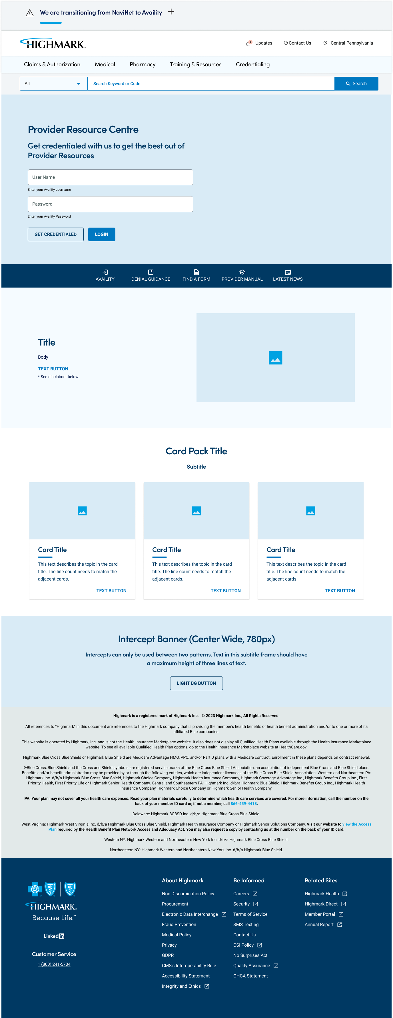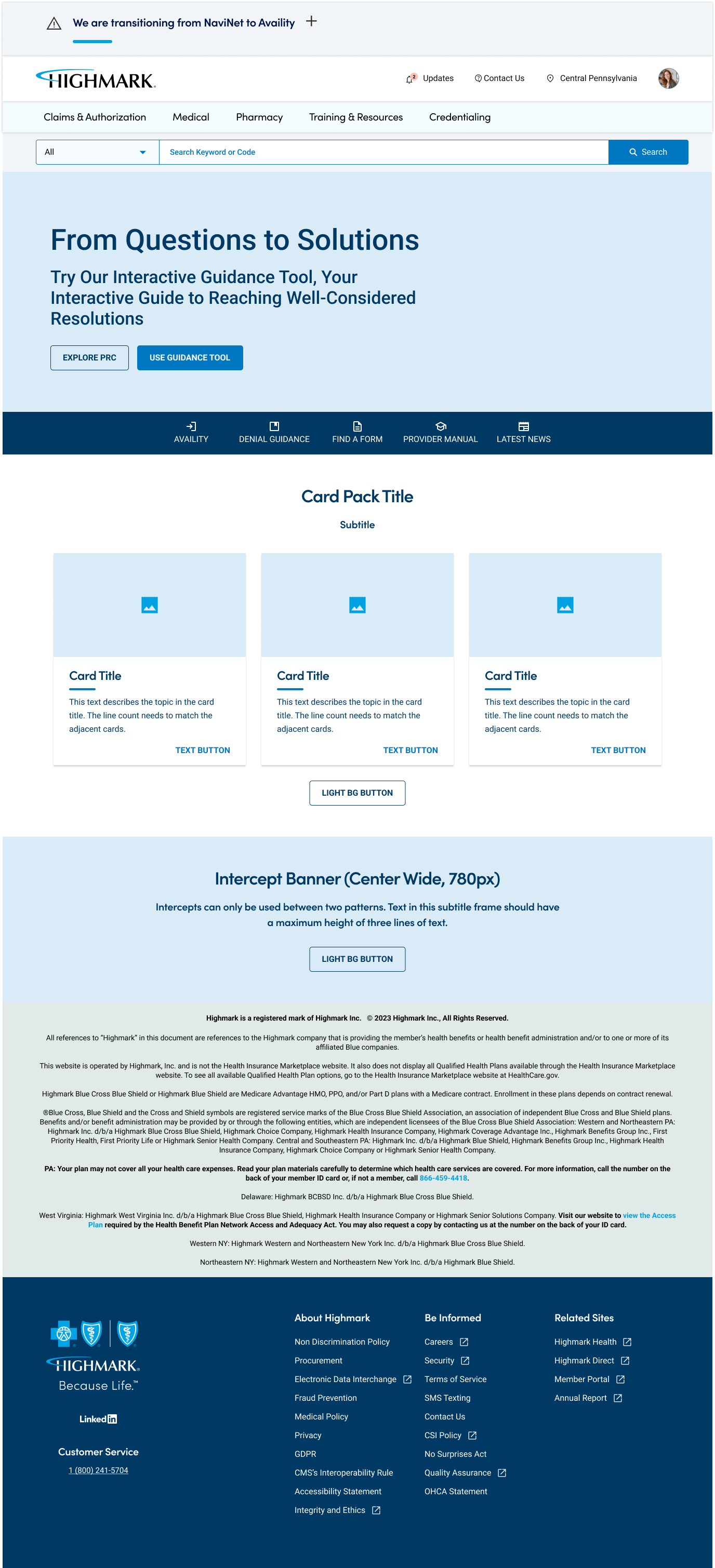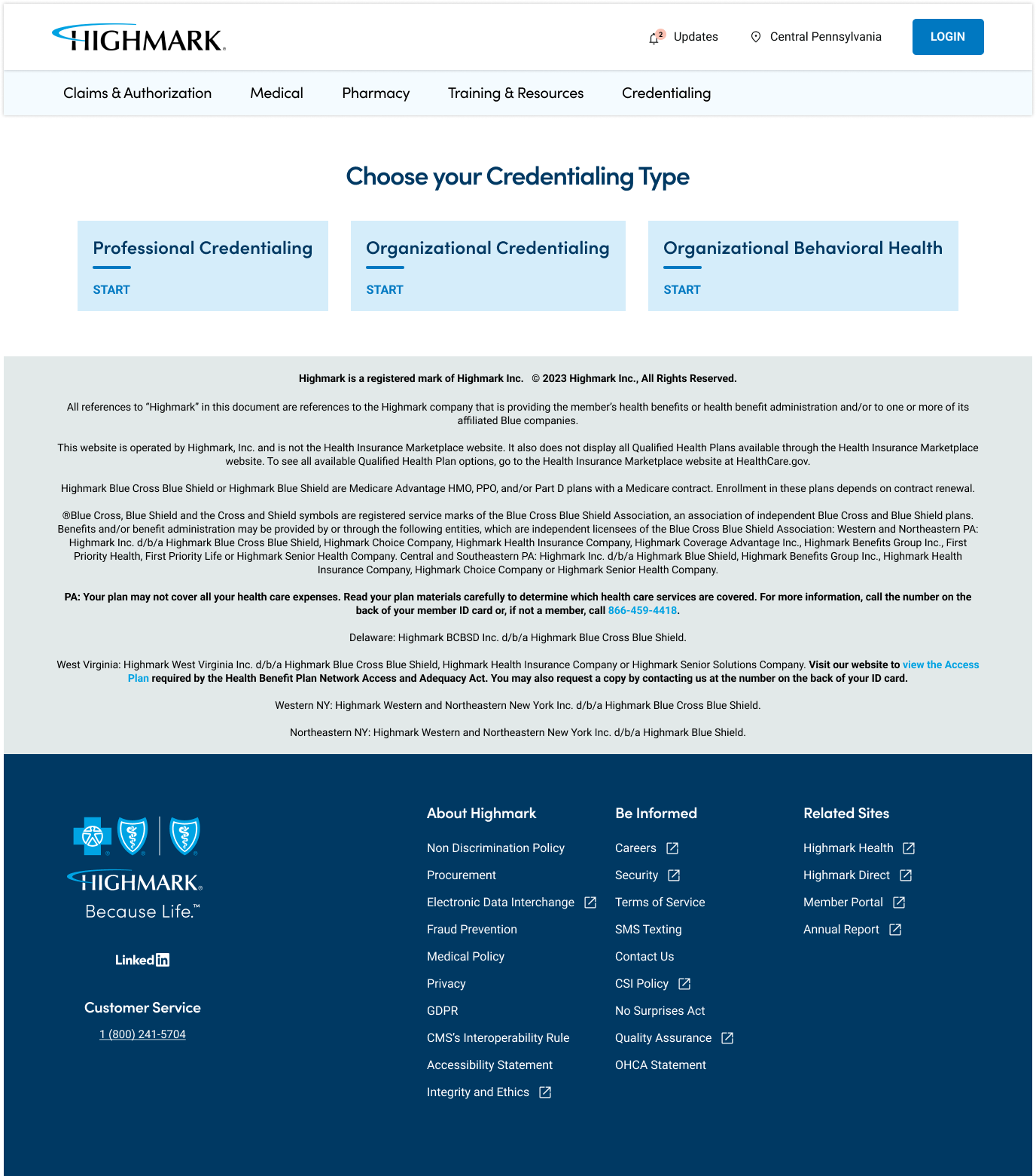
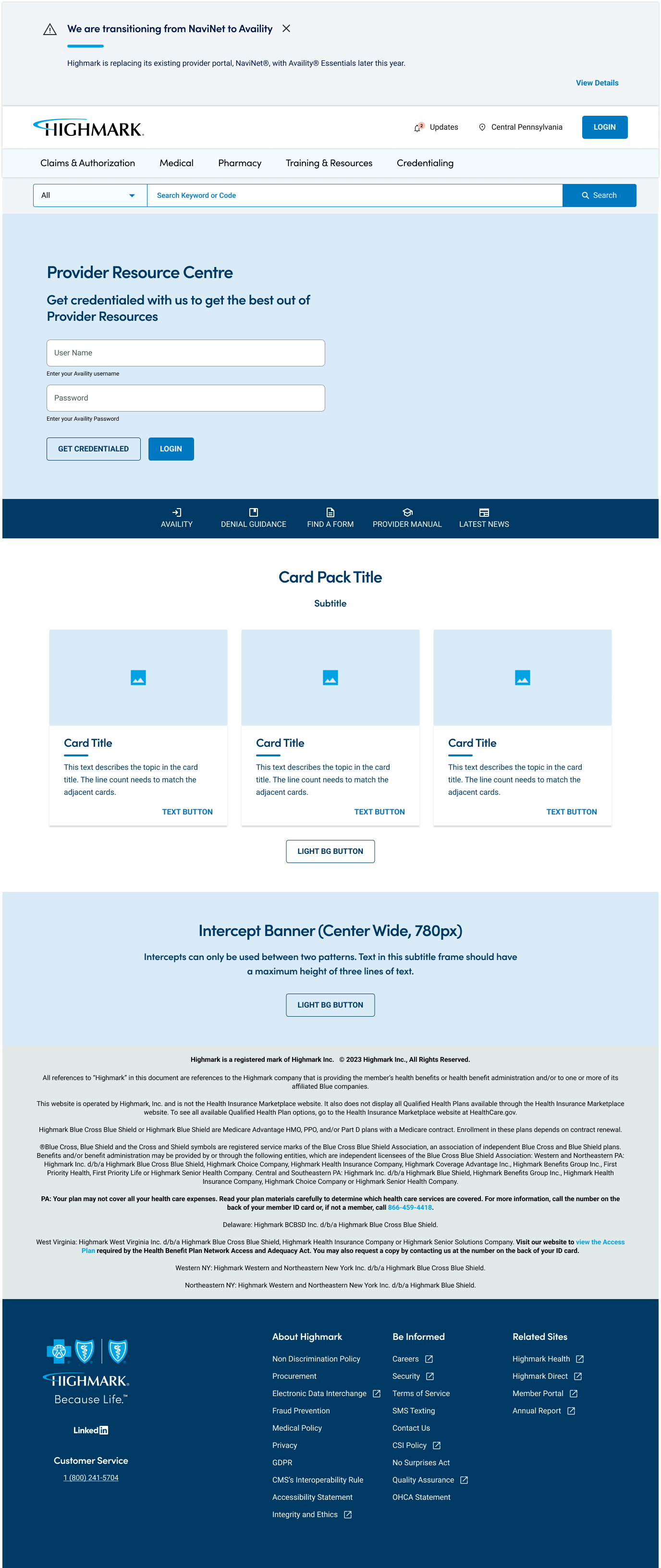
Highmark: Provider Resource Center
A digital platform offering healthcare providers easy access to essential resources, including claims management, patient eligibility, policy updates, and educational materials. It streamlines administrative tasks, enhancing efficiency and supporting high-quality patient care.
Problem
Highmark’s Provider Resource Center was plagued with several issues that hindered healthcare providers from efficiently accessing the information and tools they needed.
Key problems included:
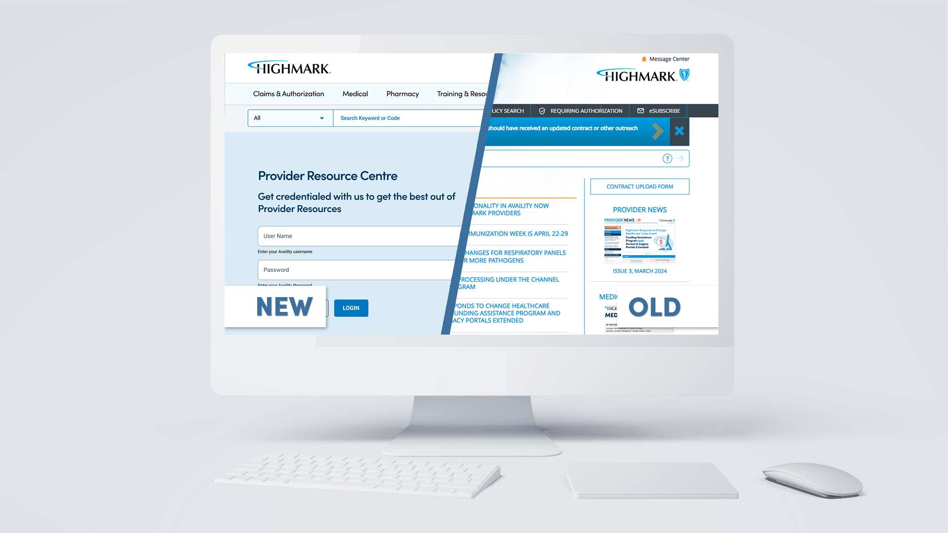
Complex Navigation: The platform had a convoluted navigation structure, making it difficult for users to find relevant information quickly. Providers often had to click through multiple layers to reach the desired content, leading to frustration and wasted time.
Outdated Design: The visual design of the portal was outdated and not aligned with current web standards or Highmark’s brand guidelines. This not only affected the user experience but also impacted the perceived credibility and professionalism of the platform.
Limited Functionality: Essential features and tools were either missing or inadequately implemented. For instance, the search functionality was basic and did not support advanced filtering, making it challenging for providers to locate specific resources.
Inconsistent User Experience: The lack of a cohesive design system led to inconsistencies in the user interface, causing confusion and reducing overall usability. Different sections of the portal had varying styles and interaction patterns.
Non-Responsive Design: The existing portal was not optimized for mobile devices, which was a significant drawback given the increasing reliance on mobile access among healthcare providers.
Solution
To address these issues, the redesign of Highmark’s Provider Resource Center focused on creating a user-centered, modern, and highly functional platform. Key solutions implemented included:
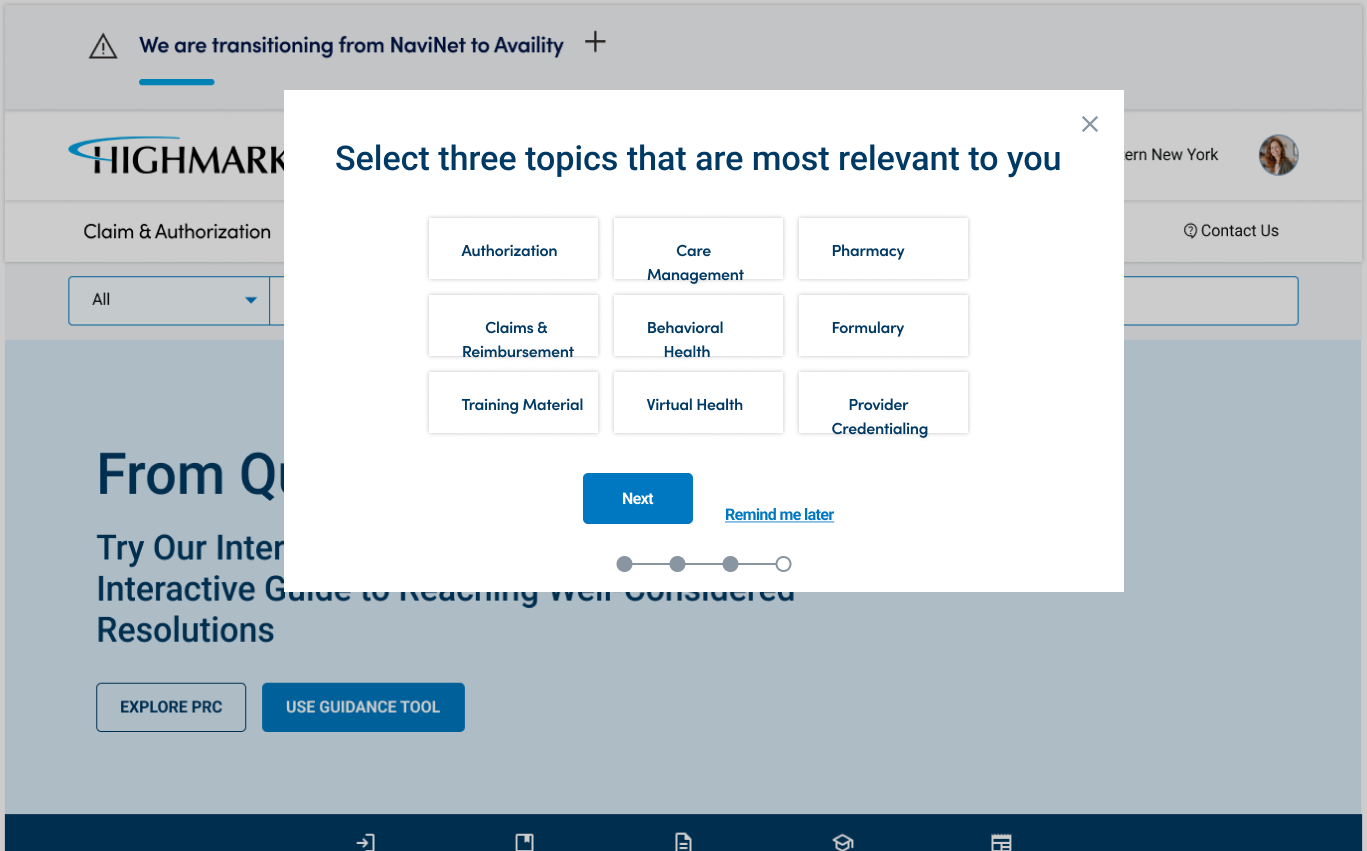
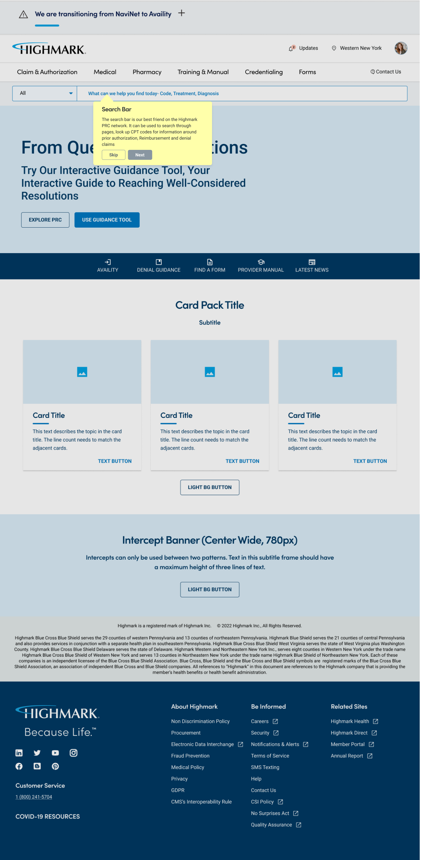
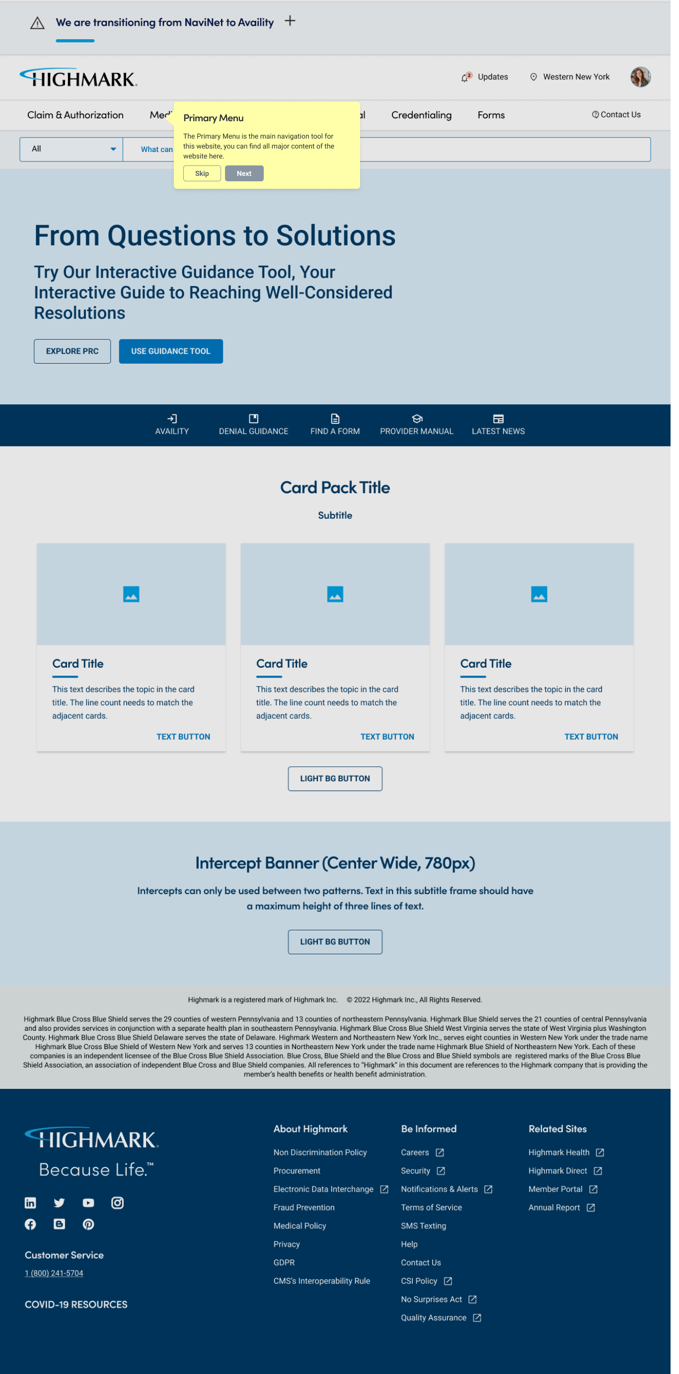
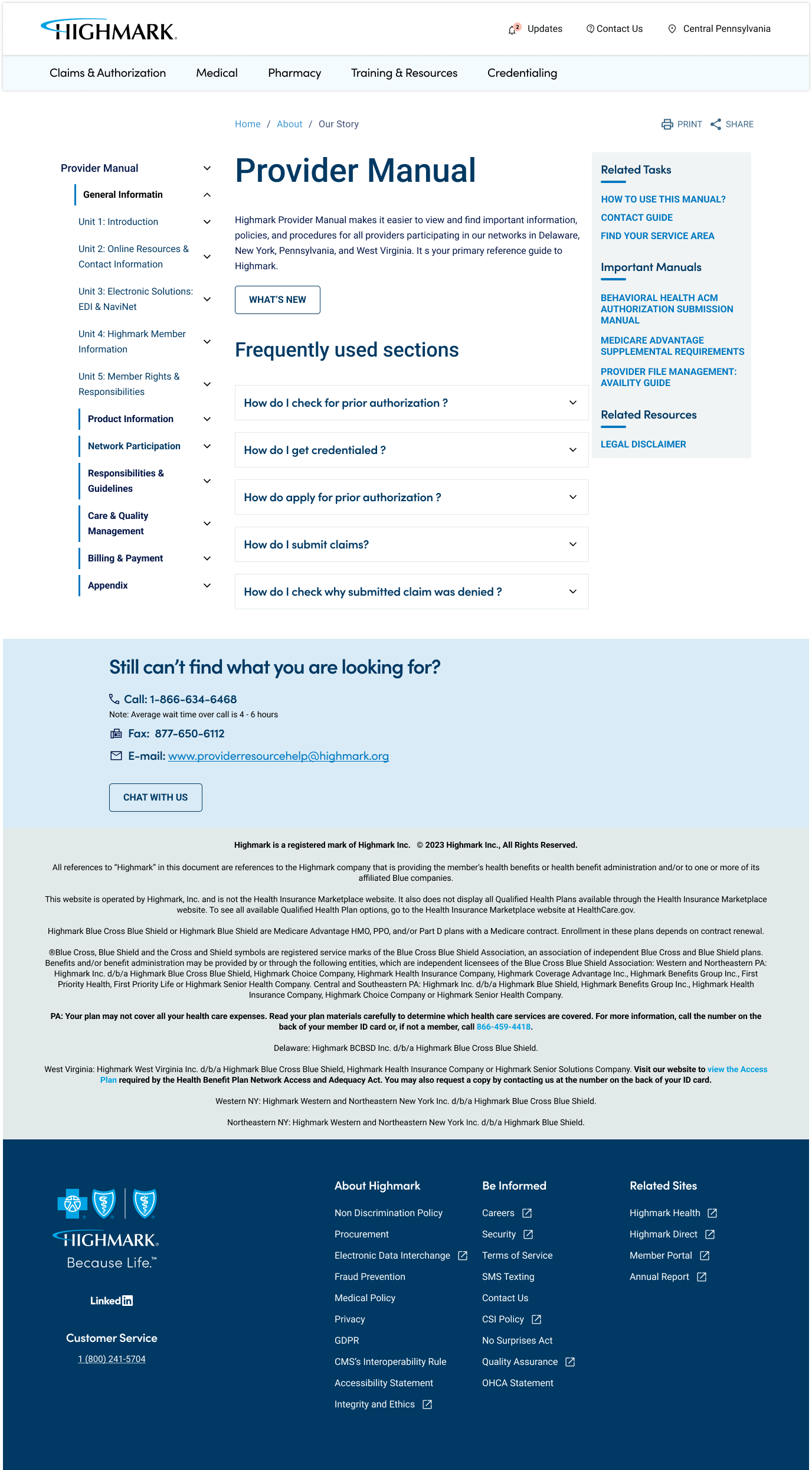
Streamlined Navigation: Simplified the navigation structure, reducing the number of clicks required to access key resources. Introduced clear, consistent navigation labels and a logical hierarchy to improve ease of use.
Modern Visual Design: Developed a fresh, modern visual design that aligned with Highmark’s brand guidelines. Used a clean, professional aesthetic to enhance credibility and user trust.
Enhanced Functionality: Implemented an advanced search feature with filtering options to help users quickly locate specific information. Added a customizable dashboard, allowing providers to personalize their experience by pinning frequently used tools and resources.
Consistent User Experience: Created a comprehensive design system and component library to ensure consistency across the platform. Standardized interaction patterns and visual elements to provide a cohesive user experience.
Responsive Design: Ensured the portal was fully responsive, delivering an optimal experience on desktops, tablets, and mobile devices. Prioritized mobile-first design principles to cater to the increasing use of mobile devices among healthcare providers.
These solutions collectively transformed Highmark’s Provider Resource Center into a user-friendly, efficient, and modern platform, significantly improving the overall user experience and satisfaction.
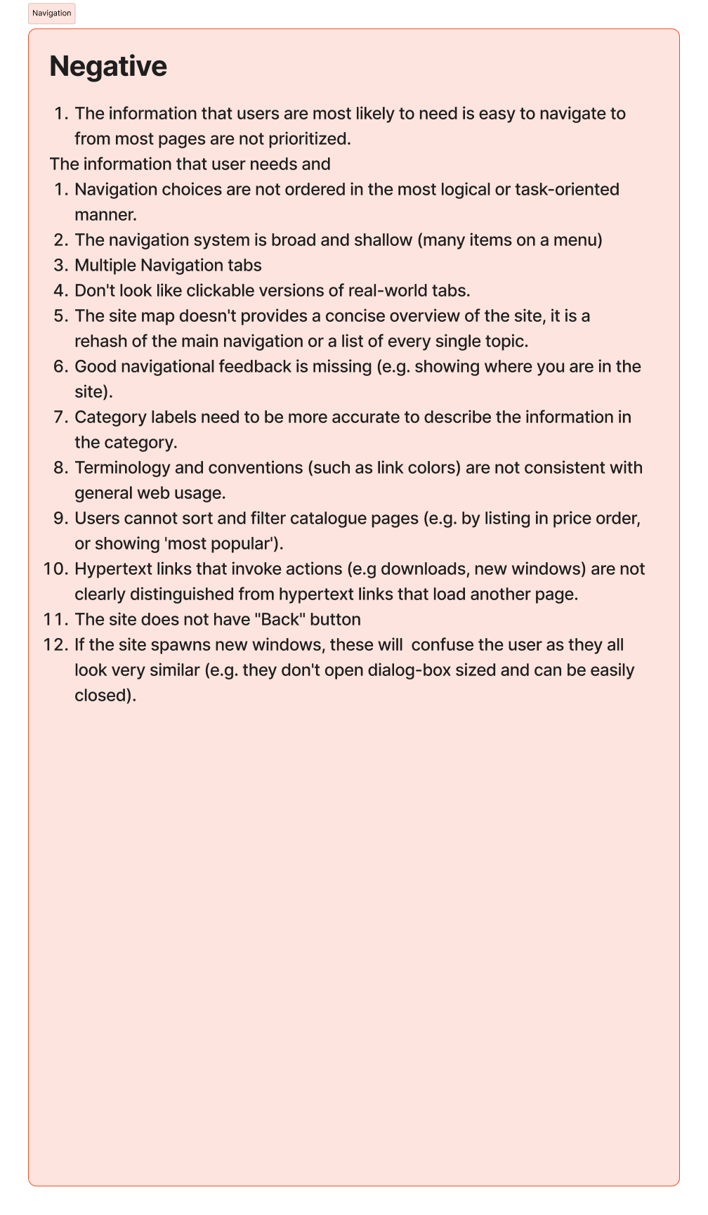
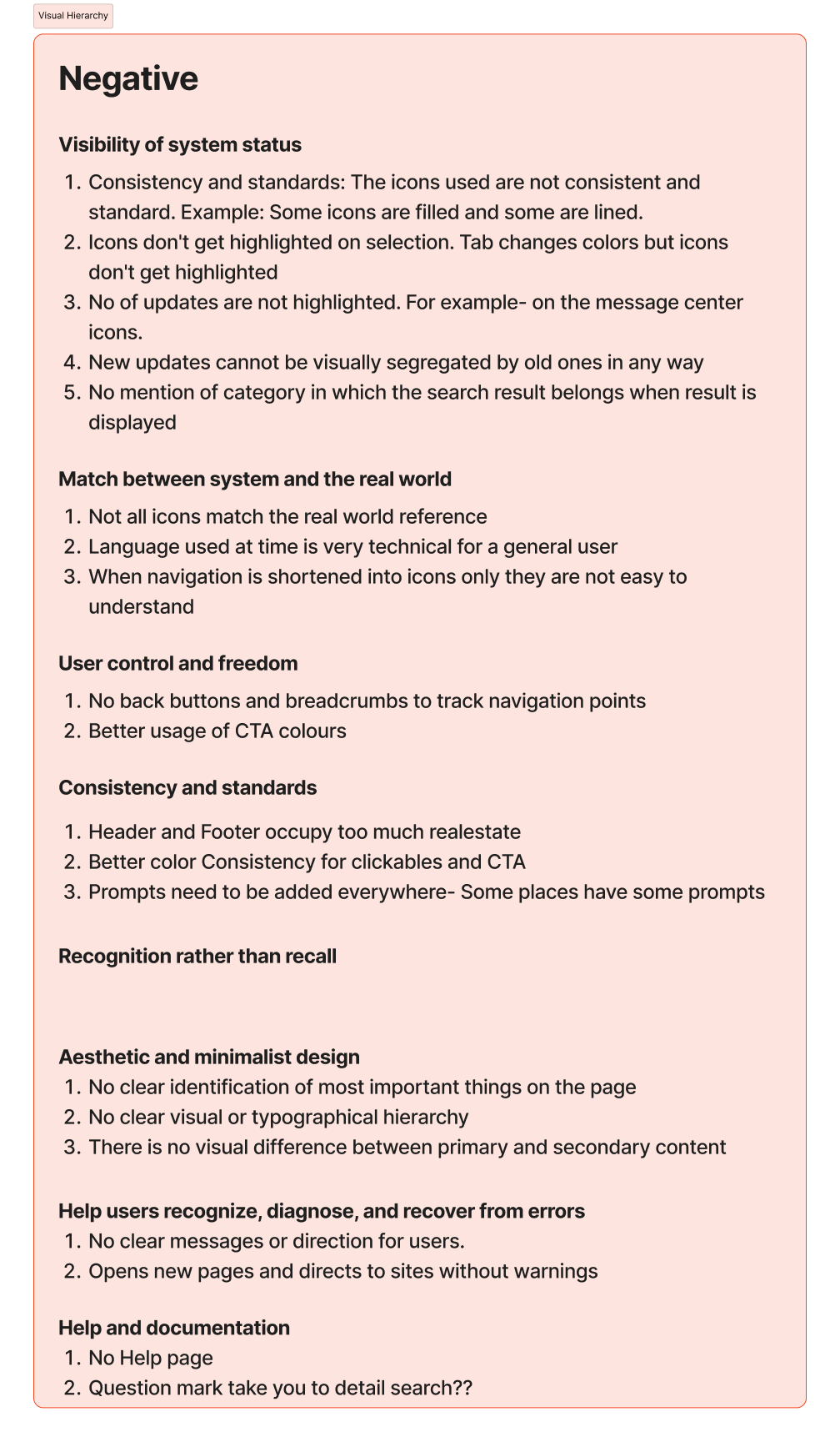
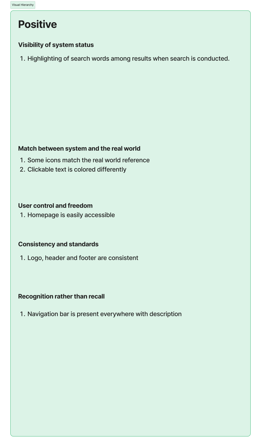
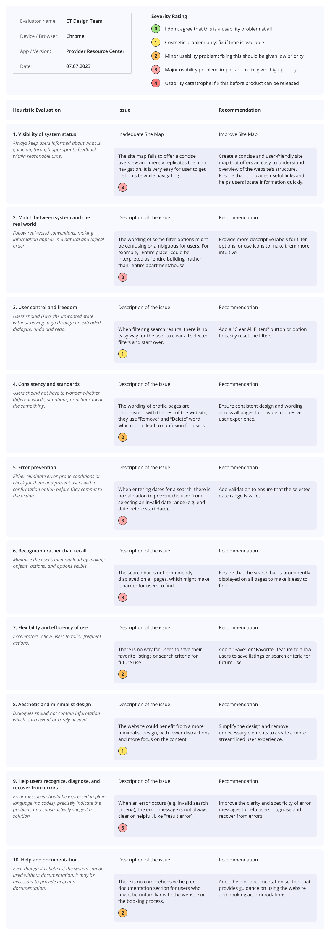
Heuristic Analysis
To identify usability issues and areas for improvement in Highmark’s existing Provider Resource Center, a thorough heuristic analysis was conducted. This analysis evaluated the platform against established usability principles, commonly referred to as Nielsen's Heuristics.

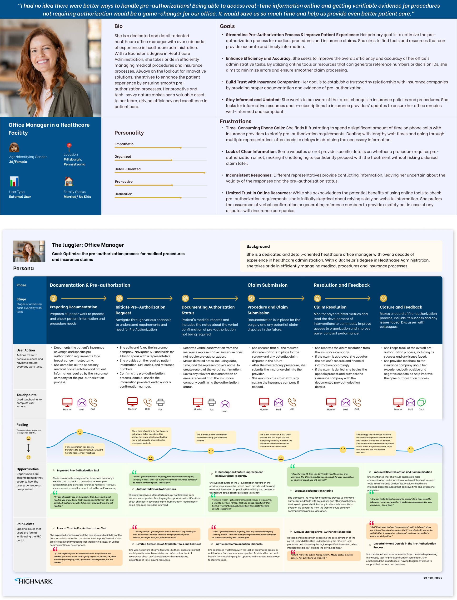
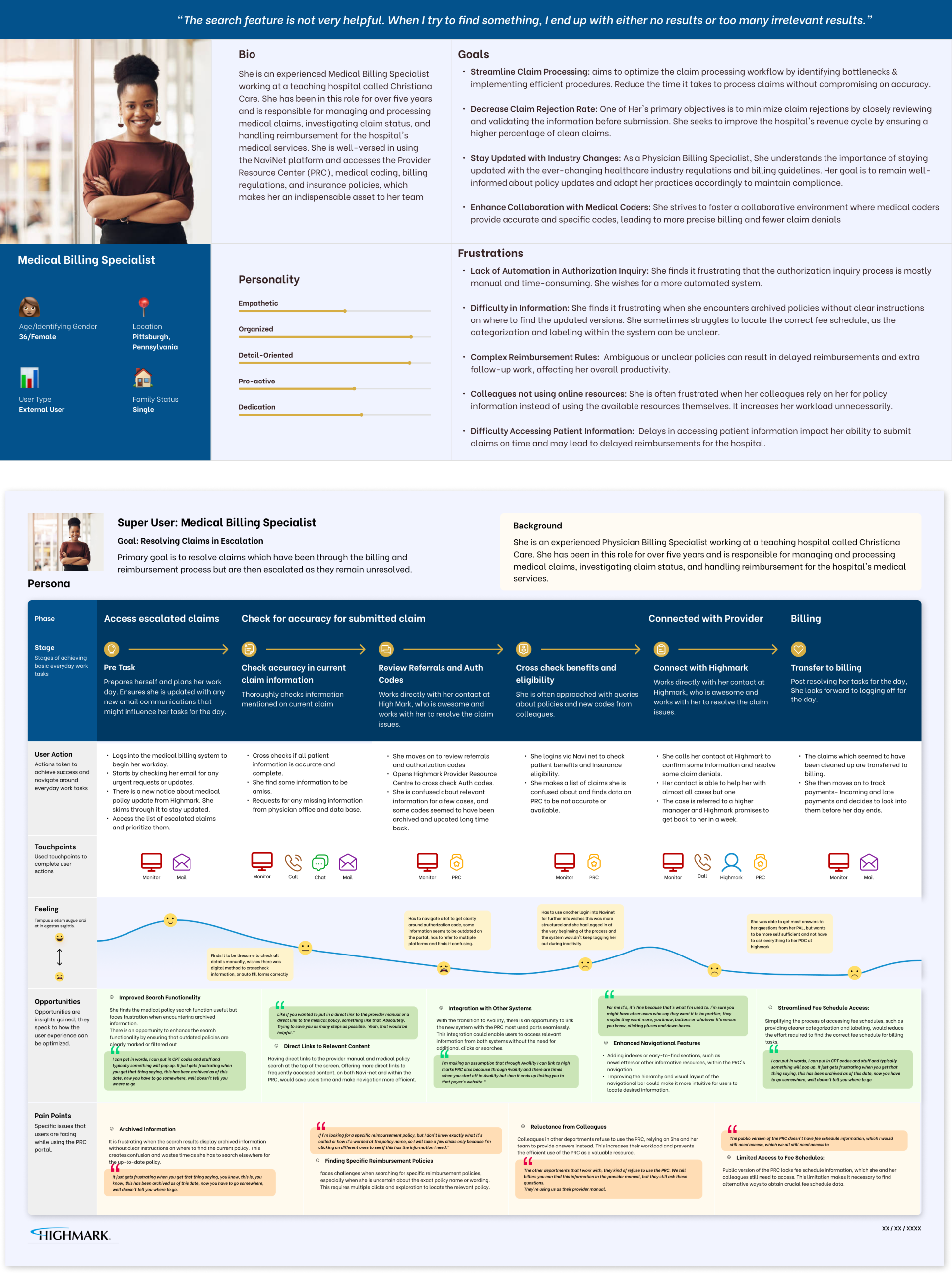
Personas & Journey Maps: External Users
To ensure the redesign of Highmark’s Provider Resource Center was user-centered, we developed detailed personas and journey maps based on comprehensive user research. These tools helped us understand the needs, goals, and pain points of external users, primarily healthcare providers, and guided our design decisions.
By developing these personas and journey maps, we were able to empathize with the external users of Highmark’s Provider Resource Center and design a platform that addressed their specific needs and challenges. This user-centered approach ensured that the redesigned portal was intuitive, efficient, and aligned with the real-world workflows of healthcare providers.


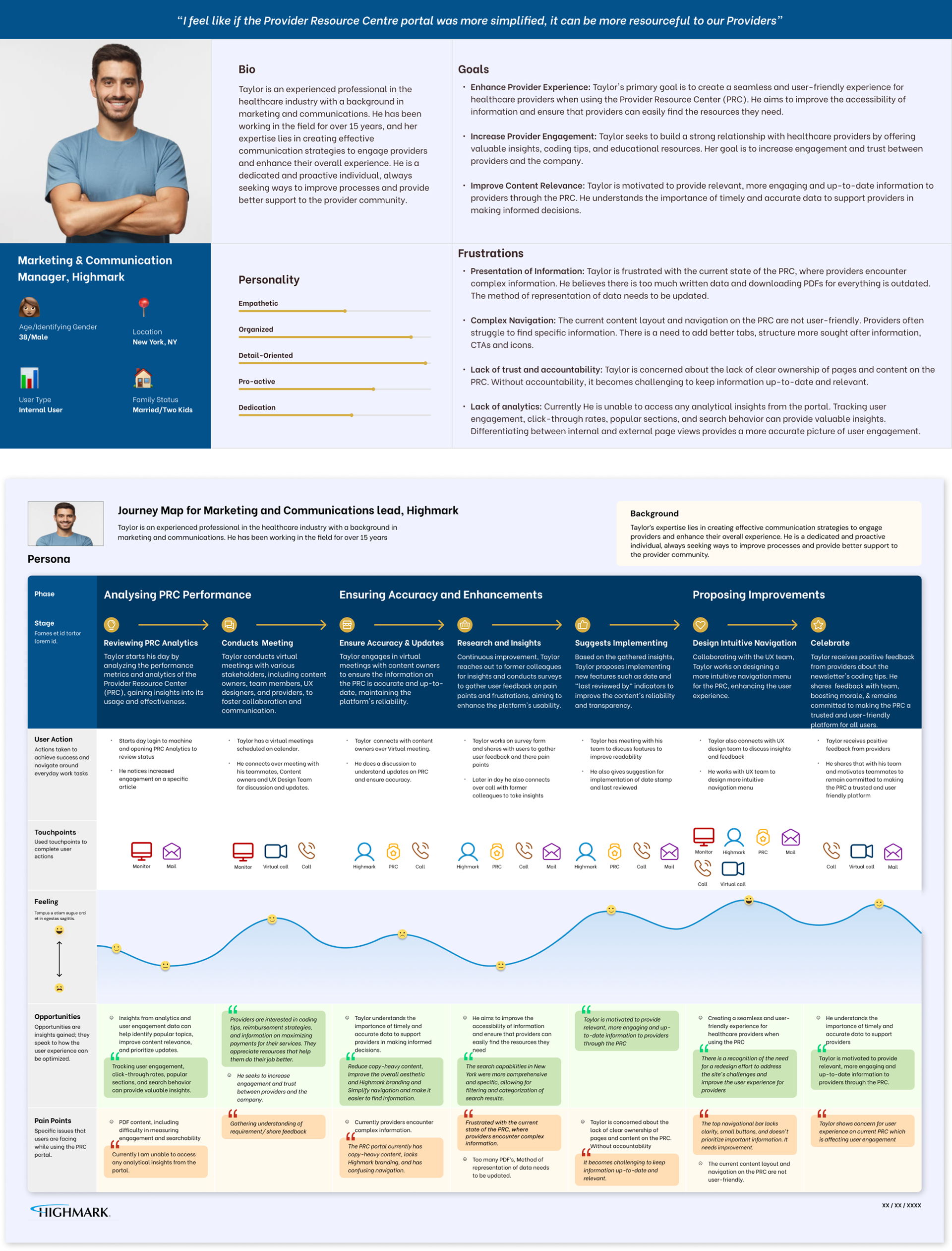
Personas & Journey Maps: Internal Users
To ensure the redesign of Highmark’s Provider Resource Center met the needs of all stakeholders, we developed detailed personas and journey maps for internal users as well. These users include support staff, administrators, and other internal stakeholders who interact with the portal to manage and support healthcare providers. By understanding their needs, goals, and pain points, we ensured the redesign addressed the full spectrum of user requirements.

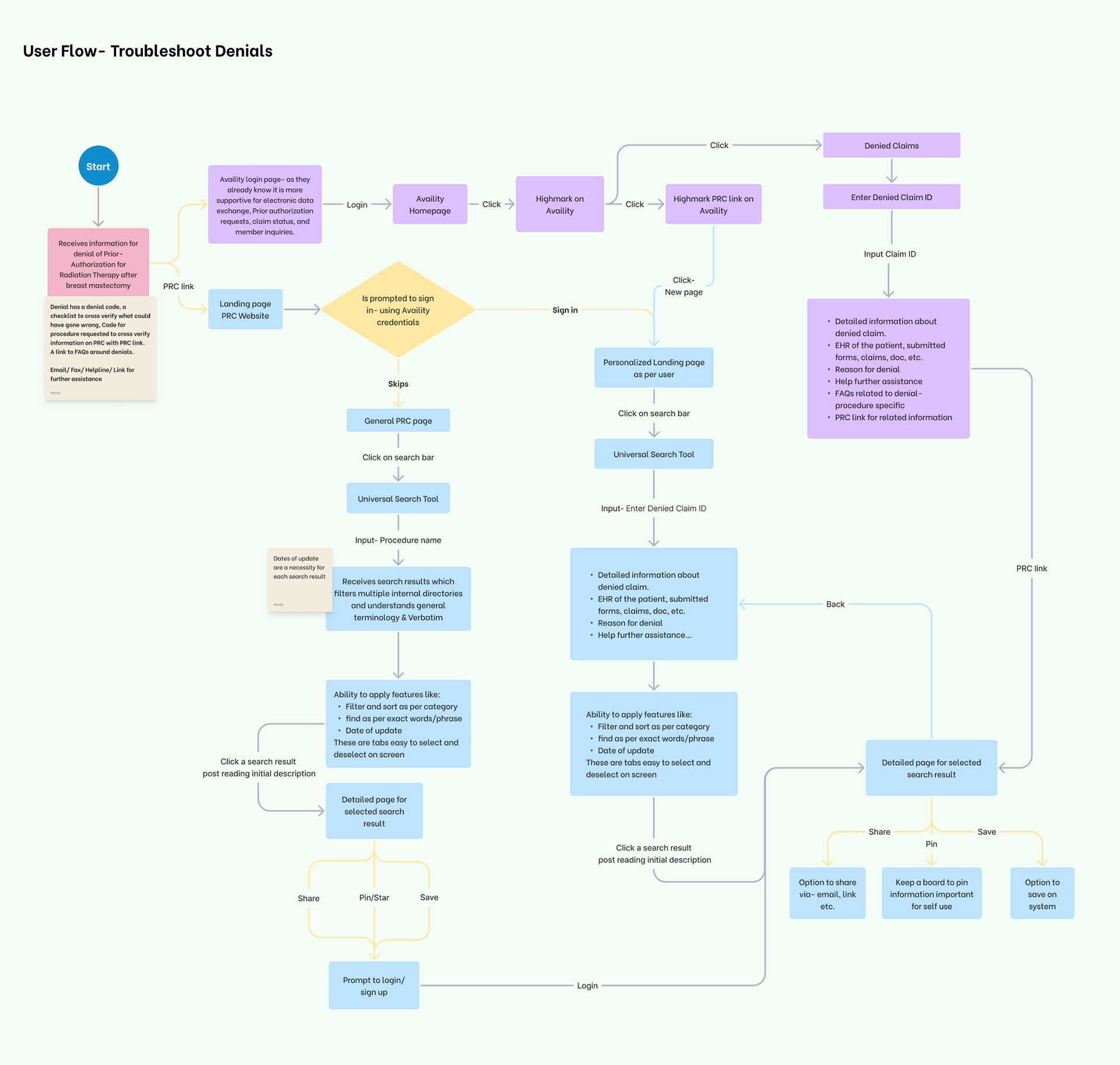
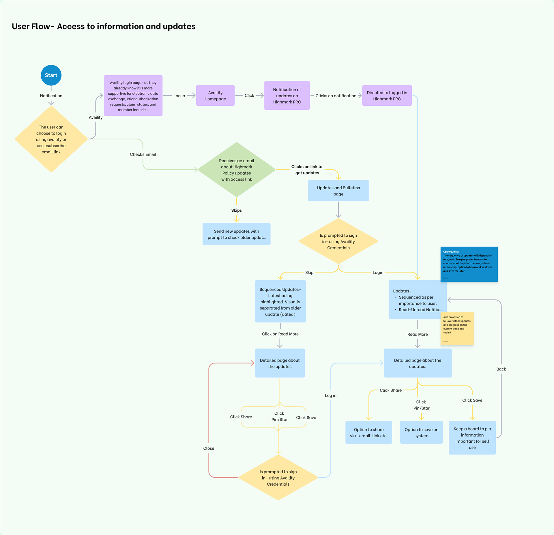
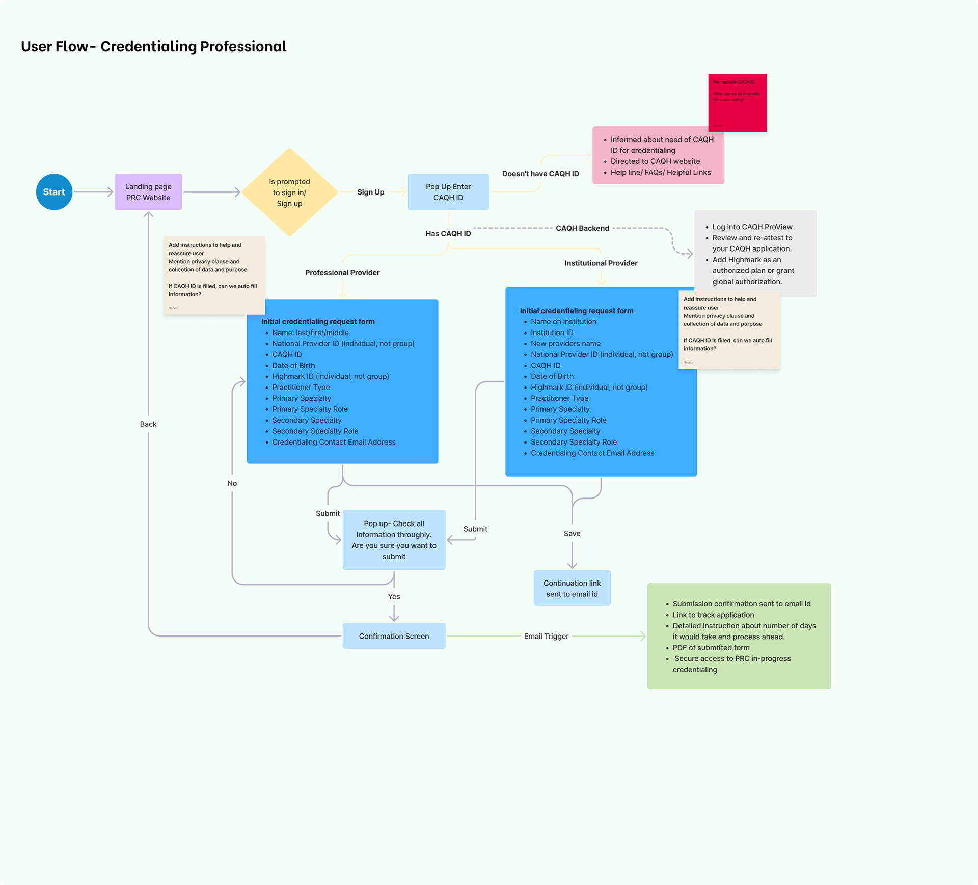
User Flows
Understanding the typical paths users take to complete tasks within Highmark’s Provider Resource Center was essential for the redesign process. We meticulously mapped out user flows to identify potential bottlenecks and streamline key interactions. These user flows informed our design decisions, ensuring a smooth and efficient experience for both external and internal users.
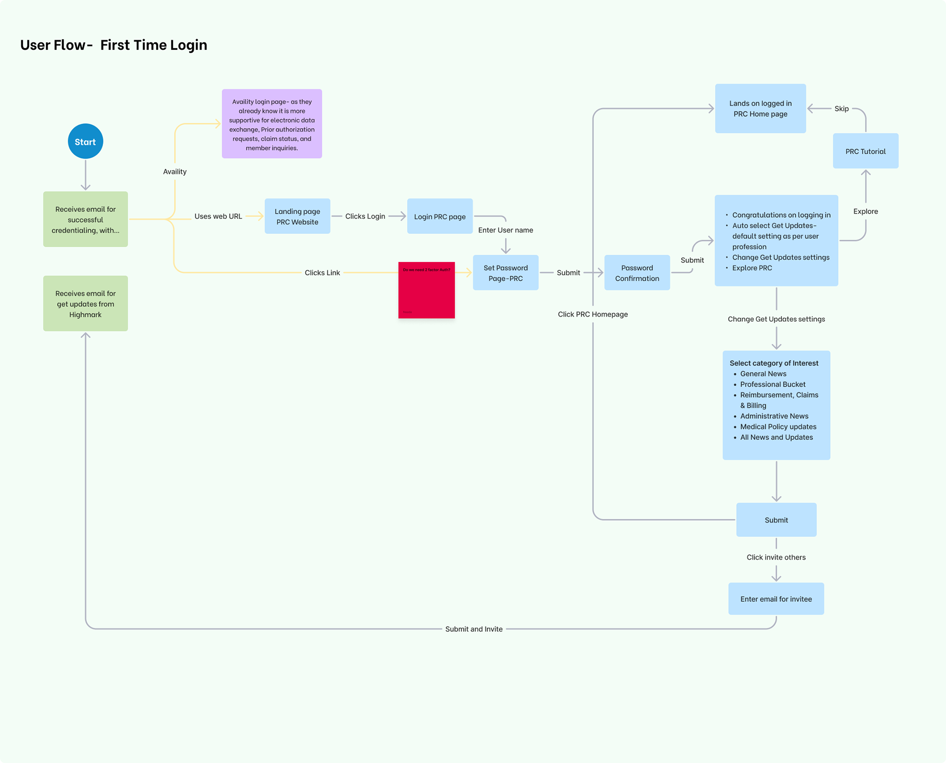

Prototypes: First Time User


Prototypes: Prior Authorization
Prototypes: Credentialing